UI Feedback Docs for your Developers
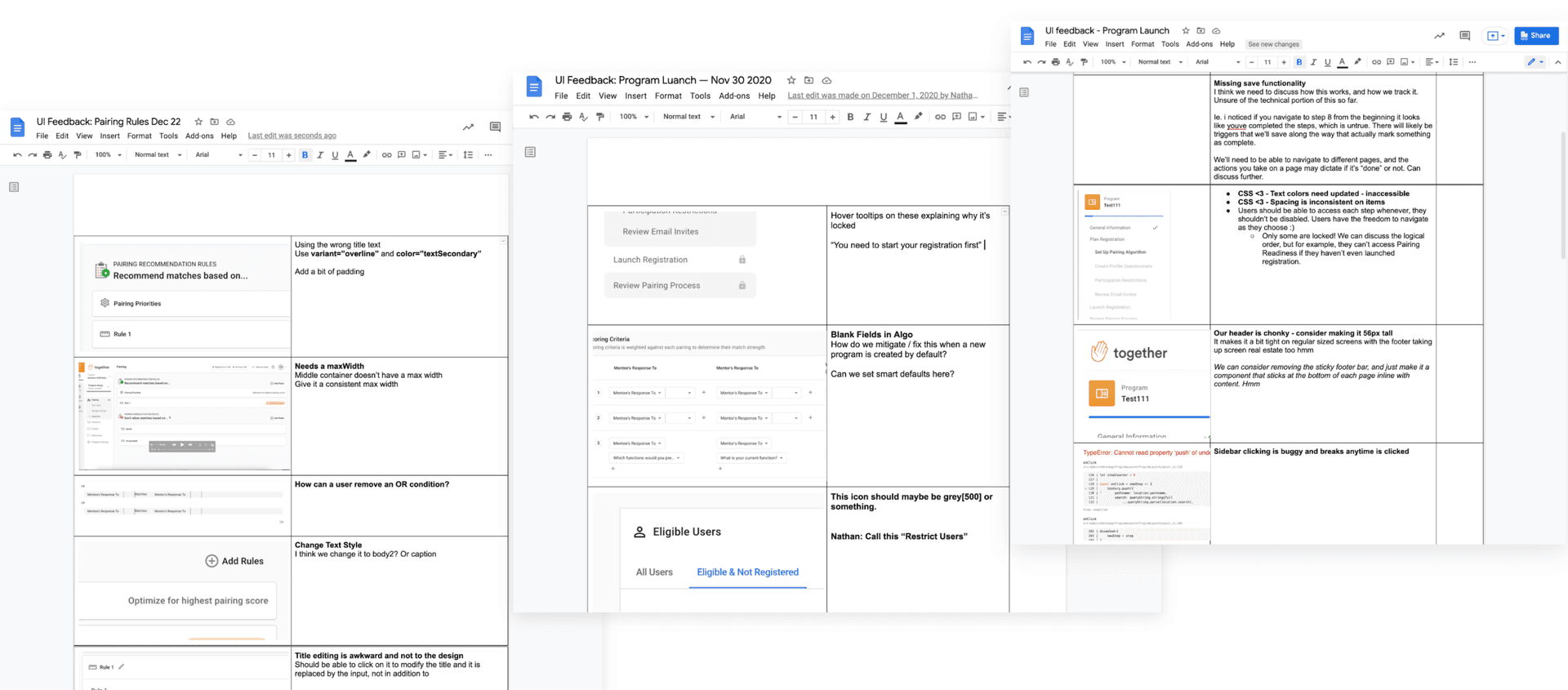
Sunday, February 6, 2022One habit I've formed when shipping products is to write UI Feedback docs. I love them because they're simply the best way I've found to share issues and get them worked on fast. They generally have high clarity and are fast to put together. I've stumbled upon this practice and have taught it to a few designers.
I'll usually write them after I've handed off a design to a developer, the design has been built, and some parts of the implementation is off, or part of the design itself could be improved. I'll demo what's been built in a test environment, take screenshots (the command + shift + control + 4 shortcut is your friend here), and fill out the doc as I test.
Common problems include:
- Padding, margins, layout issues
- Incorrect color usage
- Typography styles are off
- UX copy needs iteration
- Hover and active states need work
- Design elements need an iteration now that we get a feel for them in the browser
At this point I'll crack open a Google doc, create a two column table, and go to town. The format is quite simple.

These docs sometimes get attached to a JIRA ticket called Fit & Finish and are added to the current sprint before being shipped, or get worked on in the following sprint after we ship. It depends on timelines and team negotiation. We all aim to ship quality product, but there's always room for sacrifices to be made!